JobUp
Imagining an empowering job searching experience for applicants.
ROLE
Product Designer
TIMELINE
April 2022 (3 Weeks)
STRATEGIES
User research, UX/UI Design, Prototyping, Presenting
TOOLS
Figma
Product Designer
April 2022 (3 Weeks)
User research, UX/UI Design, Prototyping, Presenting
Figma
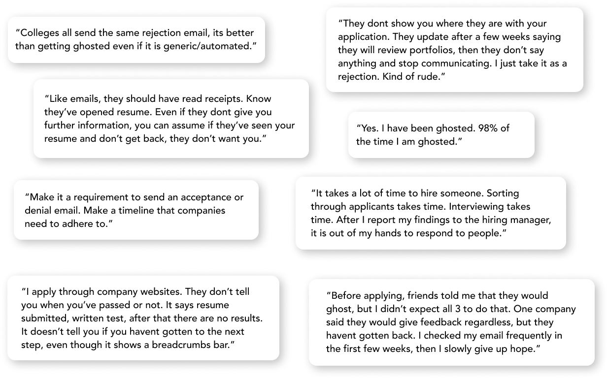
This is a passion project for the UX Design class I took during my 2022 spring semester at NYU as a junior. The idea arose from my experience applying to summer internships. There seemed to be a great opportunity to create some change and improve the current user experience of applying to jobs and waiting for updates. Job seekers find themselves getting “ghosted” (a slang term typically used when one person stops replying with no closure in a budding relationship) by employers.
The main problems people applying to jobs face are getting ghosted or being stuck in limbo by being met with complete silence after applying to a job due to the unstructured process of the job application system, which leads to applicants not knowing whether they are still being considered or already rejected. If only the application process was more transparent and if there was an easier process for employers to sort potential applicants, and send update/rejection/acceptance emails which would allow thousands of applicants to gain clarity on their position.
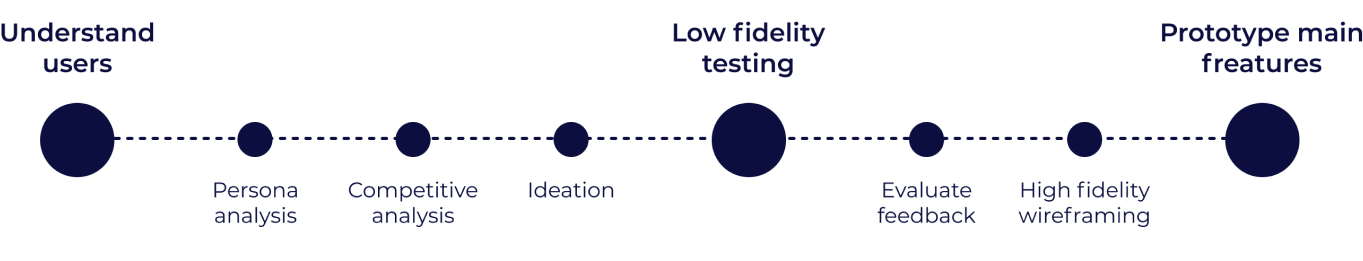
In order to define the roots of the problem, I needed to get into the shoes of the people that I am designing for. I conducted 5 one-on-one interviews with college students searching for internships and 1 one-on-one interview with a hirer. Here are some direct quotes of what the people had to say.
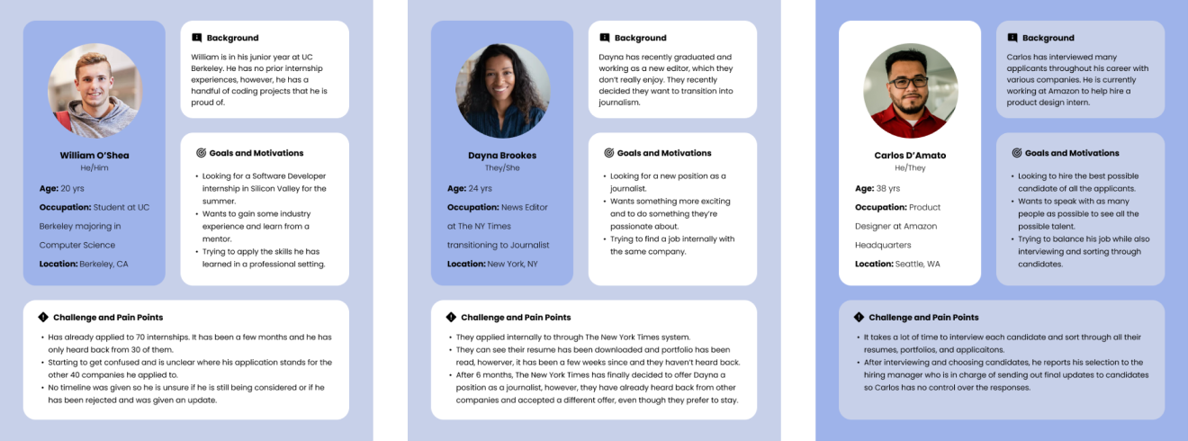
Based on the feedback and answers from the interviews, I created a few personas to explore the various goals and pain points different people in different situations have.
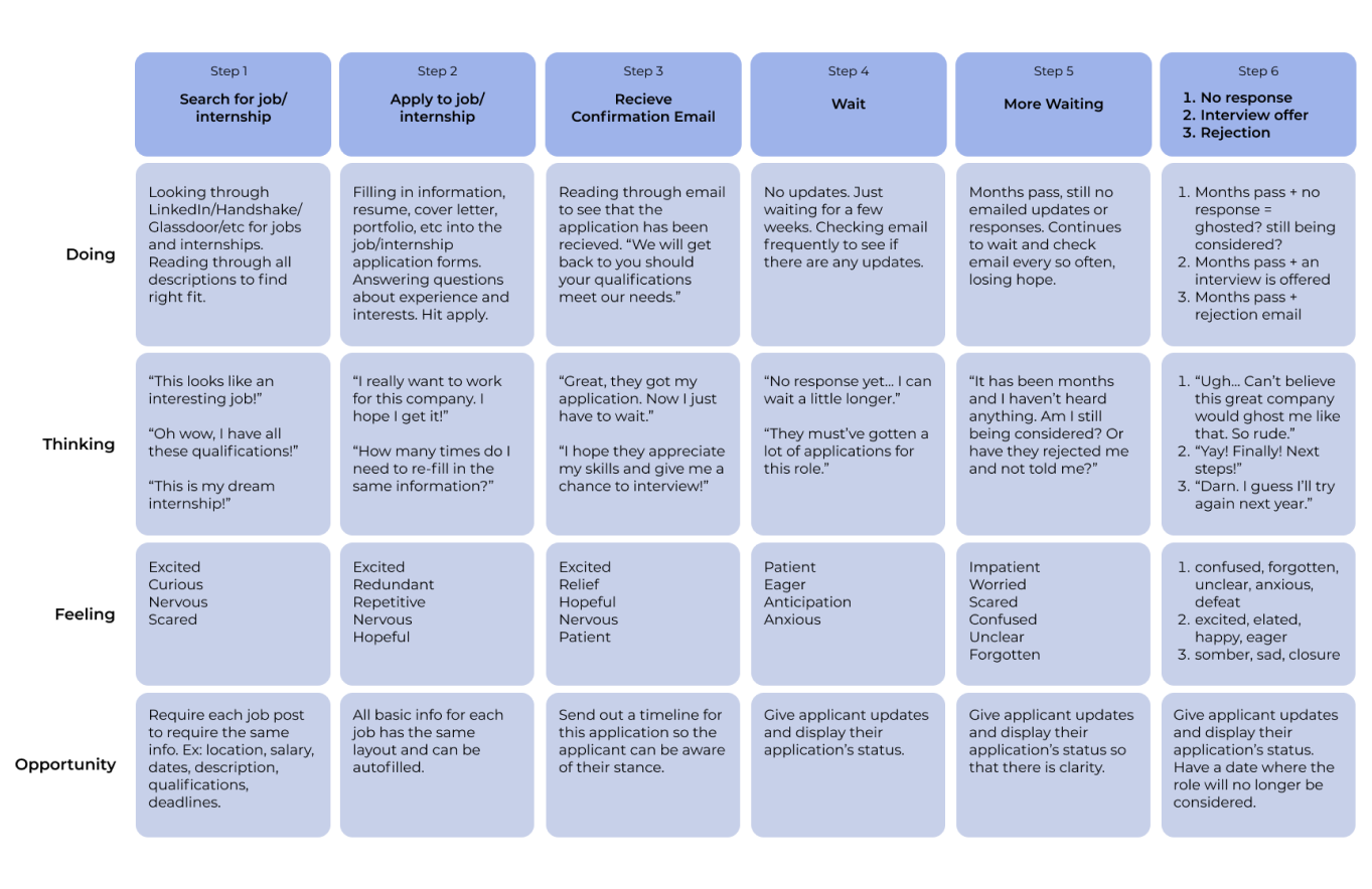
From those user interviews, I drafted the current journey the hiring process that an applicant goes through to get a grasp of what they think and feel while going through this process. From there, I spotted opportunities for improvements at each step.
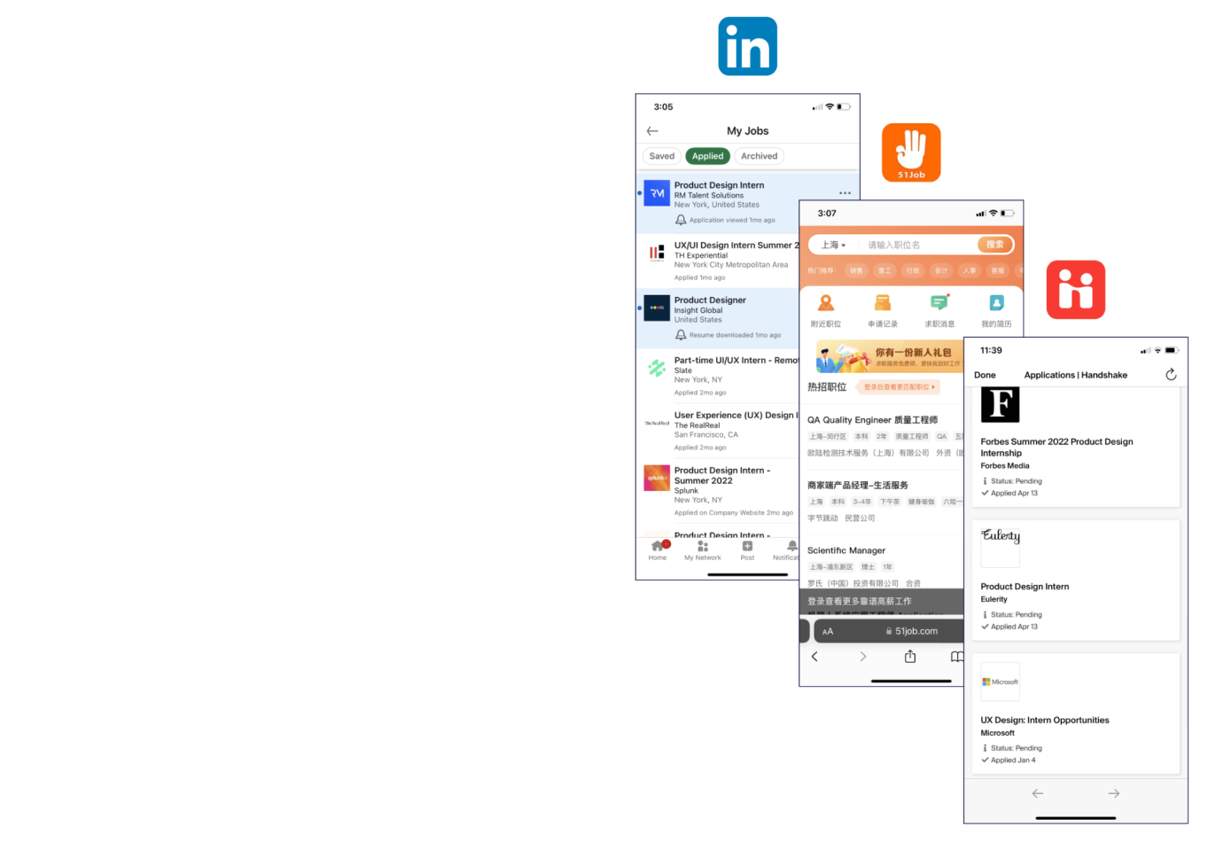
I took a look at some of the current job search and hiring apps to get an idea of what they do well and areas I could improve.
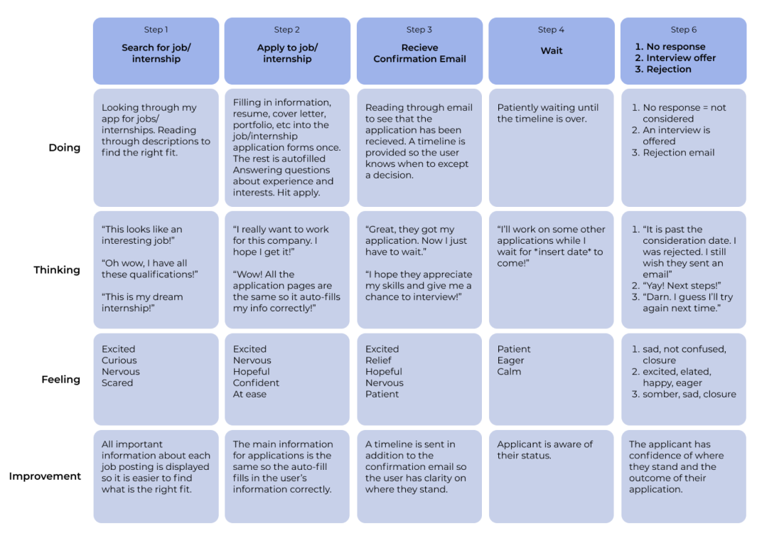
After analyzing the research I had done, I envisioned the ideal future state journey for the applicants, improving the issues that presented themselves throughout the process.
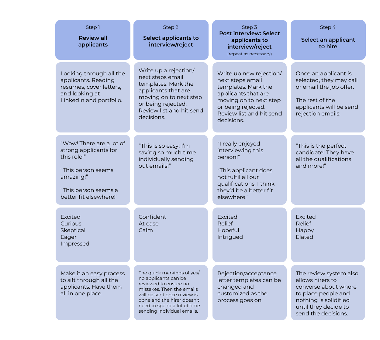
I also envisioned the future state journey for hirers looking to hire potential applicants, assuming that they look through each application.
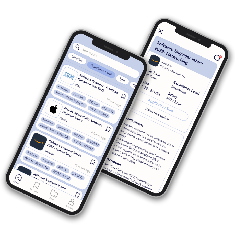
Using those two future state journey maps, I created the ideal user flow for applicants and hirers. This app would allow the user to sign up as either a hirer or applicant (but they can change this status in the settings). The focus is less on social networking, like LinkedIn, but specifically for hiring and applying.
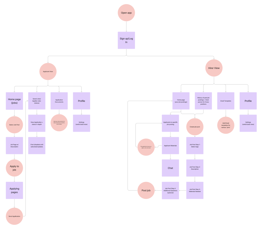
I did some testing with 5 users to help make various decisions with my design, for example whether the status should be displayed as a breadcrumb status bar or just written out. Another example was if all past applications should stay in an “applied” tab or if there should be an additional “history” tab for past applications that have results.
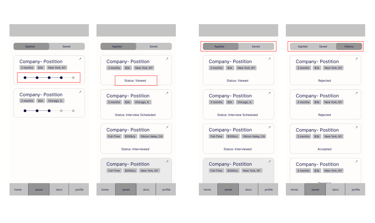
For example A, wireframe #2 was the better choice because in #1, if the company has a really long recruitment process, then it would be quite overwhelming to see the steps and it may not be clear where you are in the process. Whereas #2 says clearly what your status is. The status will be changed from the employers end.
For example B, wireframe #2 was the better choice as well, because mixing many applications with current applications can create confusion and it is also a lot for the user to scroll through. Seperating pending applications and finalized applications allows users to focus on one section at a time, whether it be to look through pending applications, or to look through past applications to see what to improve.
I prototyped high-fidelity wireframes of the main important functions of JobUp using Figma. View the prototype presentation below!
It was crucial for me to test my ideas because the users helped inform me that some of some design decisions I was debating between were not very helpful or overwhelming. By A/B testing some low-fidelity wireframes, I was able to improve my design before diving into creating high-fidelity wireframes.
There are many thoughts and feelings that are attached to users when they are completing tasks. Although the journey may seem straight forward, it is important to stop and note what the user is actually thinking and feeling during the process to pinpoint opportunities of improvement.
Building a brand new product from the ground up was quite the task, especially when there are so many similar platforms. This just meant that there were many opportunities for competitive analysis to see how I could build upon existing platforms and change the mission. Job rejections are hard, but it was nice to make it a little easier. If I were to continue this project, I would like to expand my research to encompass more job searchers to better understand a wider range of experiences, as well as interview more hirers to get a grasp of how they sort through applicants currently.

© 2022 Nina Chu | Designed and Developed with Love