NYU Albert

Envisioning a more efficient education course management system for the students of NYU.

ROLE

UX/UI Designer

TIMELINE

Nov 2021 (1 week)

Nov 2022 - Dec 2022 (3 weeks)

STRATEGIES

User research, UX/UI Design, Prototyping, Observational Testing, Iterating

TOOLS

Figma, Miro

ABOUT THE PROJECT

NYU Albert is the website students use to view degree progress, enroll for classes, check official grades, and view their school schedule. I overheard students students voicing their frustrations about various usability issues and bad experience when using the website, so I decided to do a personal design sprint project to envision a more user friendly version of NYU Albert.

THE PROBLEM

Before jumping into the research, I came up with a general question.

How might we help students create their academic schedules more efficiently?

Below is NYU Albert's Current Model

PROCESS BREAKDOWN

DEFINING THE PROBLEM

I started the process by creating a survey to see how NYU students currently rate their experience using NYU Albert. I received 27 responses.

Survey findings show that the average rating for NYU Albert overall is 4.6/10.

The participants were also asked to elaborate upon their rating, as well as given an opportunity to discuss their experiences. I compiled all the issues that were mentioned, and created an affinity map to sort all the issues into 5 categories.

USER PERSONAS

Reflecting upon the research that I conducted, I created two personas of students with various goals and pain points to keep in mind while designing.

SOLUTION IDEATION

After collecting quantitative and qualitative data from students and sorting the issues, I brainstormed some ideas and functions to include in my design to improve the experience.

USER FLOW

Then I created a user flow as a guide for how the user would ideally go through NYU Albert. This also informed me on what pages I needed to design and create wireframes for.

DESIGN VERSION 1

Although the current NYU Albert does not follow the NYU design guidelines, I made sure to follow the NYU Design Guidelines when designing my final product to maintain consistency.

This concluded my 2021 design sprint for NYU Albert. I thoroughly enjoyed tackling the usability issues and finding solutions for the problems that arose. Due to the project being a sprint and completed in one week, there are still additional steps I would like to take with this project for the future. I would like to conduct some usability testing with the prototype that I have created and discover areas of improvement to iterate upon my designs.

USABILITY TESTING: SURVEY & OBSERVATION

One year later, I decided to revisit this project to continue the testing process.

I observed 5 users go to the Tisch:IMA classes, leave to find another class, and check their schedule using both the current NYU Albert and my prototype.

The users were instructed through a Google Form to perform those 3 tasks with both designs and asked to rate each experience on a scale from 1-5 (1 = very difficult, 5 = very easy).

The overall improvement in ratings validated that my design was going in the right direction.

I looked back at the recordings to observe and time their process. Watching how the users interacted with my prototype gave insight to areas of improvement as well as areas of strength where the interactions were more seamless.

Success: Decreased the average time it took to get from the home page to the Tisch Interactive Media Arts page by 45.5%!

OBSERVATION INSIGHTS: AREAS FOR IMPROVEMENT

1. Schedule Buttons

4 out of 5 users did not complete task 3 of looking at the schedule in various formats due to not being able to locate the calendar buttons.

2. Color Coding Classes

The user who opened the schedule expressed that color coding the classes would make it easier to view which classes are recurring.

3. Shorten Class Descriptions

When users have a specific class they are searching for, they are typically not reading the descriptions for all of the courses. They are primarily skimming the titles to find what they are looking for. Shortening the descriptions while allowing students to expand leads to less scrolling while still keeping the option of reading the full description.

FINAL SOLUTIONS

Clear Customizable Schedule

A modern UI has been applied to the homepage. There is a list view for information and schedule view for visualization. Students can view and expand their schedule with a click of a button, as well as, color code their classes to see recurring classes.

Seamless Course Search Navigation

The affinity mapping and observation testing shaped the design of the course search. Students can now easily browse classes from various schools and majors.

No more starting from the beginning or scrolling through a long list of majors.

View Class Overlaps

Students are able to quickly search and switch between classes and see how new classes fit with their current enrolled classes or classes in their shopping cart.

No more starting from the beginning after clicking into a class.

TAKEAWAYS

Unbiased Surveys

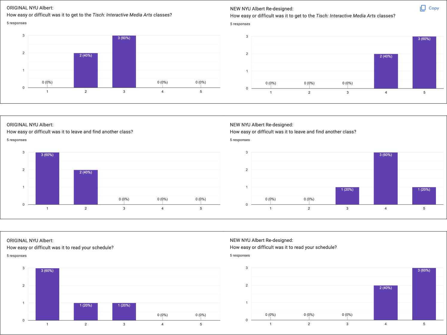
I realized the first survey I sent out included biased language, such as “how difficult is this function?” Therefore, while I had to leave out some data from the initial survey due to biased language, I adapted and applied unbiased language to the second survey I conducted during the observation testing.

Big Changes

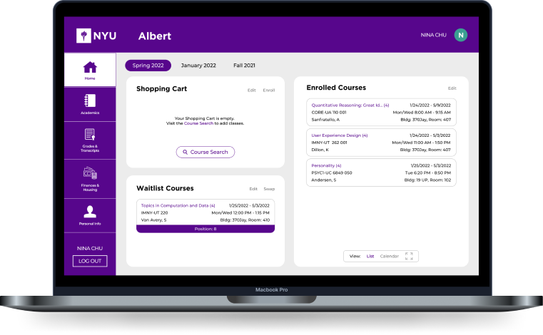
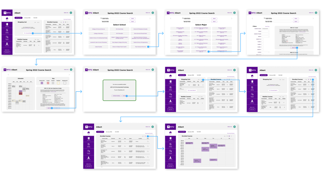
When I designed the first version of my NYU Albert, I didn’t want to veer too far from the current NYU Albert design because I wanted it to feel familiar. However, after observing users try out my design for their first time and navigating through it seamlessly, I learned that it’s okay to make big changes. If the new design is cleaner and more intuitive, then it doesn’t need to have remnants of the original design.

REFLECTION

This NYU Albert project was extremely retrospective considering I decided to continue working on a design challenge from one year ago. I was able to apply my newfound knowledge to the latter of the project and see improvements within my research and design skills. In the future, I would like to present this case study to NYU to make Albert easier and more efficient for thousands of students.